Sunday, October 28, 2007

Self Portraits of Many Emotions


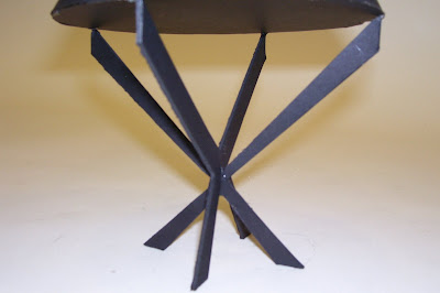
This is a movie clip of my self portrait project. The project itself contains a total of eight self portraits of me that demonstrate different emotions at the time of creation. I felt that a video would best show my work because the physical project is about six feet tall. To help with confusion the video was filmed vertically so it might help to turn your head to the left to get the real effect. This was not my favorite project I would have to admit because I felt that my self portraits are not as good as others and they resemble me as much as they should. I am quite pleased with my design of the display unit. Having four pictures on opposite sides creates interaction with the viewers because it causes them to actually walk around the display.

Design Research: ten interiors

A Marble Bathroom
I think this the most beautiful bathroom that I have ever seen. I would absolutely love to have this bathroom in my house. The entire room seems to just glisten in the image. I believe this is because of the reflective marble, shiny silver hardware, the glass shower door, and the accent lighting. I like how the arches are repeated several times through the entire bathroom. I find it aesthetically pleasing that the paint color is found in the marble also. The marble just blends in except for a shiny effect that it gives. I think the white bath tub and the white sink look very good with this cream marble and paint. I think that is the right color choice.
Source: www.architecturaldigest.com


The Perfect Children's Bedroom
I absolutely love this children's bedroom. This is the exact room that I have wanted as a child. These are the exact colors that I would associate with a little girl. This is the cutest set-up for a bed. I am not quite sure if is a bunk bed or the bottom is the bed and the top is a little loft that the child could play in. This room reminds me of something that would be on Trading Spaces: Boys vs. Girls. This appears to be a room that some elaborate designer would design. Not something a normal parent could think up of.

A Fast Food Restaurant Gone Good
I find the transformation of this fast food restaurant into a nicer dining venue to be a great success. This photo taken at night really helps set a mood of a nicer feeling. I would not think that this used to be a fast food restaurant. I like how the flooring matches well with the wood that makes up the booths. A also like how the front legs of the booths are made with the black metal pipes instead of the same wood. I think the sage green of the material of the cushions and the curtains works very well with the lighter colored wood. My absolute favorite thing about this sitting situation is the lighting at each of the booths. The light bulbs at the top of the black poles is very unique but also aesthetically pleasing. I have never seen this done but it looks very cool.
Source: www.metropolismag.com


A Very Modern Kitchen

I absolutely love this kitchen because of the overall design and the color scheme. I think that the dining room in the glass room is a very clever idea because to me it seems like it is a display box. When I think of dining rooms I think of something elegant and somewhat dressed up. This is why I find it interesting that it is displayed through the glass wall. The only thing that I find wrong with the kitchen and with several of the kitchens I have commented on is that I think it best functions in magazines instead of a real working kitchen. I do not think anyone could keep the kitchen clean at all times.
Source: www.wallpaper.com


A Modern Tract Home

I actually am quite fond of this living room mostly because of the color schemes. The whites, grays, and blacks work very well together. One of my favorite aspects is the ceiling to floor white curtains. They just seem to brighten up the room and in a special lighten the darker accent colors. The thing that I do not think looks very good is the railing coming up the stairs. It does not fit in with the color schemes. I think the owner of the house could have just as easily changed the railing out so that a new one could follow the color scheme a little better.
Source: www.dwell.com


The Family Style Kitchen
Personally I do not like a single thing about this design of a kitchen. I do not see how any family could function within this room. There is practically no work triangle and if there is then it can not technically be considered one because the sides of the triangle would be too long. The black wood stove to me seems to be out of place. It looks like someone randomly placed it in the middle of the floor. The only main that thing that I am able to understand and comprehend is the design of table in the image. I can see how it can fit into the particular style of the kitchen, only is really of the suroundings.
Source: www.dwell.com


St. Bartholomew's Church
I personally do not like the arrangement of this church. I have grown up knowing that pews are supposed to be in a church not some futuristic leaning chair. The church itself is very beautiful. It doesnot bother me that in the renovations of the church they changed some of the walls to bring out the dry wall slightly. In my mind I can imagin some darker wood pews preceding down the nave of the church. I just do not understand how these very modern chairs can fit in with the context of the original church itself. They just look out of place.
Source: www.wallpaper.com

Nestle Building
This is the Nestle Chocolate Building in New Mexico. This is definitely not what I would expect a chocolate factory to look like. In fact this is actually the area that visitors would arrive and tour. I think that the room is too white and overwhelming. I think all the different angles of the ceiling and the structure are interesting, unique, and original to this building only. I like the black accents so much that I think a little more could have been added to counter balance all the white. I would love to visit this building sometime.
Source: www.wallpaper.com

A Modern Kitchen

There are aspects about this interior that I like and dislike. The main thing that I like is the dining table that is shaped in a unique "L" shape. The wood that lines the top surface of the table works so well with the white base. The intention was to make the wood appear to be levitating and the white base to blend in with the flooring and walls. This attention to close detail makes the work even better. I have to admit that I do not think that the stainless steel counter tops fit into the rest of the design as well. I would have loved to have seen either a brown color similar to the tabletop or even the same material as the table top on the counter tops. One disadvantage to the white flooring, walls, and cabinets is that after using the facility one time they would all be damaged if caution was not used in the preparation of a meal. Another neat aspect about the table is that when looking at it, like from the angle in the picture, our eyes tend to follow the horizontal piece that looks to be pointing to the glass window and the view which can be seen form the table.
Source: www.wallpaper.com

The Rock Kitchen

When hearing the name Frank Lloyd Wright we automatically think of something amazing and incredibly designed. I do not disagree with this statement except for this one exception. I do not find the rock bulging into the kitchen to be very attractive. This is a kitchen from the Massaro House designed by Frank Lloyd Wright. The only thing that I really like about this kitchen is the skylights that bring natural light over the work triangle in the kitchen. Possibly if this same incorporation of the rock was used in a different type of dwelling then I think it would be more functional to the design. Maybe this idea could be used in a restaurant or some kind of resort. I can understand the restriction of sticking to a house because of the location, the natural environment, and the topography of the surroundings. I also appreciate the natural look that was being designed with the rock, wood, and natural light.
Source: www.wallpaper.com

Wednesday, October 24, 2007

First attempts at Shading


The style of shading that I like the best and the only one that have worked with is smudge. We were told that we need to try two different types of shading for these two drawings. I chose hatching for the bottom drawing and cross-hatching for the top drawing. They actually look better on this blog than the actual paper on which I did them.
Hopefully I will get better at these styles.

Sunday, October 14, 2007

Design Research: ten designers


Frank Lloyd Wright
He is a wonderful designer and architect. I absolutly love Frank Lloyd Wright's designs. He is my favorite designer. He is very famous for his Falling Water house and all of his Prairie style homes which are environmentally friendly. He always designed to complement the environment that the dwelling was to be housed. Just like with Falling Water he designed for the structure to be built over the creek. The materials of the building also were common materials found in the environment of that area.
Source: www.wikipedia.org

Vincent Wolf
He a great interior designer who has his own firm, Vincent Wolf Associates, inc. He designs both residential and commercial dwellings. Some of his major projects have been located in New York City and Florida. His designs are beautiful and well designed. His rooms actually look as if the client could live and function in the room. The color schemes always seem to work well with the environment that surrounds them. I would definitely love to have him design a room for me.
Source: www.thestylegroup.com

Orlando Diaz-Azcuy
He is an interior designer and architect who is from Cuba but now has a firm in San Francisco. He is more of a commercial designer with projects including the San Francisco War Memorial Opera House. His main advice for designers is that art work and different accessories give an interior character. I love the room in the picture above because of the white walls and the wood ceiling and the wooden beams. I think these two things complement each other well. I think his designs are very beautiful.
Source: www.forbes.com


Melinda Sechrist
She is an Interior designer who has also specialized in landscape architecture. She was a member of the American Society of Interior Designers and president of the chapter of Seattle. Her style of design is a cabin or mountain feeling. I really like this cabin look, especially since it is very common where I am from. The only thing that I do not like in the picture above is that the wood appears to be fake, which is very obvious. I think this room would have looked much better if the wood was real and natural. Melinda main goal while designing a room is to create everything in scale within the room.
Source: www.forbes.com

David Reed Weatherford
He is a interior designer whose work looks so elegant and expensive. His designs also have a slight modern look. I love looking around in rooms like this. Davis Weatherford has been quoted saying "Listen to the client for what he says but also what he doesn't say" (Weatherford www.forbes.com). I think this is an important quote because it shows others that you can go beyond the limit. You don't have to included just the things that the client insists but you challenge the things that they did not mention.
Source: www.forbes.com

Vincent Van Duysen
He is a designer that is capable of designing both the exterior of the buildings and the interiors. He designs residential, retail, offices, and different products. I would have to admit that I do not like his work because it is too simple and plain. I don't think anyone could really live and function in rooms and houses like this. Most people do not like completely stark white rooms. His designs look very expensive but something that anyone could complete.
Source: www.vincentvanduysen.com


Michelle Kaufmann

She designs for both the exterior and the interior. Her main goal is to create dwellings that are environmentally friendly. This is why she designs the exterior also. I personally like her designs and her intentions to better the environment. She designs specifically for the location that the dwelling is supposed to be located. The house in the picture above is meant to be located in a urban setting. It is designed for the environment of the urban setting. I love the use of windows that she uses because this helps with the lighting issue in houses. I think she is good designers with good intentions.
Source: www.mkd-arc.com/homes/mksolaire/


Tina Manis

She is an architect for her own firm, Tina Manis Associates. Her firm is based out of New York where she concentrates on residential architectural and not so much on industrial work. She said that she likes to design in a more general way instead of the male rules that we all know. With this being said she does not necessarily have a feminine style instead hers is just a everyday thing. She also stated that she does not let her design be dominated by a certain material but instead she designs from the material.
Source: archrecord.construction.com


Ken Isaacs

Ken Isaacs has said "I was always a builder. I would save my money and buy lumber and metal and actually build these projects like the Living Structures. And when you build things, it changes you. You're not just commenting intellectually on something, you're actually putting your energy on the line." I found this interesting about him because I would be the same way. I like to make things for myself so I can say that I did that. Although I find him talented I do not think the Cubes as living spaces are not functionally proper. The picture look like a play set that would be found on a playground. He is innovative and he does think outside the box but in a way that might not be functional. Ken Isaacs believes that the design world needs to take more advantage of the environment and design around it instead of designing for the needs of those around us. I cannot fully agree with this because I think that we do need to design for our needs. We would all be better off if we designed in a more environmentally friendly way.
Source: www.dwell.com


Diane Burn

She has been quoted saying “Imagination is huge for me. All of my interiors make you feel transported to another era.” This would definitely be true because her style almost reminds me of a Victorian style I believe that her designs and ideas are beautiful but are not something that I would choose for myself. Her style is very exotic and glamorous and would probably appeal to the wealthy. One reason I would not choose her style is because of the crowded and cluttered look that she incorporates into her design. If some of the items were removed from the space then I think it would be more welcoming. I do find the colors, furniture, and accessories all to be beautiful.

Source: www.architecturaldigest.com

Design Research: two new technologies


MultiBook

The MultiBook, by Rotaliana, is a new technology device that functions as several things at one time. This device functions as a digital clock, calender, a light source, and three different ports for charging electronics. An advantage to this device is that all the perks of the device itself are centrally located. This object could be placed on a desk as if it were a book laying on the surface of the desk. With this though you would also have a light source for the desk, and clock, and charging ports. Everything functions within one object. I personally like this and would purchase it if I knew that the cords would not be too noticeable because, I would want a viewer to first think that it is a regular book.
Source: www.wallpaper.com


Philips Aurea television

This television is widely being accepted for the appearance that it portrays. This device is a flat screen, which is popular at the time because of the flat look and the amount of space that the object takes up. Many like being able to mount the television on the wall instead of having a piece of furniture for the TV to sit on. The purpose of the design is to have the colors reflect onto the rim of the TV and onto the wall. With this a neat arrangement of colors occur as the colors of the programs change within the television. I personally like this television and the effects it has on the wall on which it sits and the room which it is in. I would purchase this product especially if this is the effect that I would want my room to have.
Source: www.wallpaper.com


Saturday, October 13, 2007

Design Research: ten design firm websites

Osborne & Little
This is definitely my kind of web site because of the simplicity but not the kind that you are instantly confused by. I really like the color scheme because the colors themselves are pleasing to me and my taste. The three main colors are black, brown, and a darker magenta. I think these colors work well together especially with the textiles that the company is trying to sell. They chose pictures of furniture that had a similar darker magenta color so that the pictures would be able to look like they belonged with their surroundings. My favorite part about this site is on the main page where you are presented with a slide show type thing that continuously displays images of furniture that is upholstered with textiles from this company.

Poltrona Frau
This is furniture design firm which this exact one is the New York location. I would have to say that I do not like this web site because it is the type that you have to click the enter button. I do not see the point of having to click enter to actually enter to site. Every time I visit a web site of this sort I am all the time thinking that it is out of order or it is still loading. The enter button is usually so tiny that you don't even see it sitting on the page. The only reason that I can think of is that they do not want to just send you straight to the main page and that they want to give you a heads up warning. I do not like this thought because I would just rather go straight to the site. After clicking enter you see a series of three pictures that continuously changing. The only problem is that they did not leave enough time to see all three pictures in one round. I would like for the pictures to run continuously but when the mouse is moved on top of the image then it stops so you can click it and maybe enlarge it.
Source: Wallpaper http://frauusa.com

Baker
This is another example of the type of sites that I am not too fond of. I do not like arriving to the site and being confused on what I am supposed to be clicking. Even though it looks simple it is quite complicated in the fact that clicking once will send you somewhere that will then send you somewhere else. The contents of the web site do not bother me so much as long as I can understand how to get to them. I think that the black and white on the site gives a feeling of elegance. The thumbnail pictures of the furniture are in black and white which ties into the main colors with the elegant feeling. The site has a neat room planning feature that helps fix confusion and able someone to plan out their room.
Source: House & Garden www.baker furniture.com


Larson Juhl

This web site consists of one of my absolute favorite color combinations which happens to be baby blue and brown. Similar to the Natuzzi web site this one also has soothing music upon arriving to the web site. This relates to the soothing pastel colors that make their way through the site. Although this site sounds as if it would be some kind of international firm it is really a design firm that designs frames both empty and full. The frames in the images are so beautiful. Seeing these pictures makes me want to design frames. I would have never considered this firm to be considered a design firm. I would have to agree now that I had looked through the site more that they should most definitely be considered a design firm. The ability to navigate through the site might slightly be denied because the main page has so much writing and wording. This is too clutered, which caused me to have a harder time trying to find my way through the site.
Source: House & Gardens www.larsenjuhl.com
ai3
Although Lucy Aiken-Johnson was a speaker for us I was encouraged and driven to visit her firm's web site and see the work in which they have completed. The web site is very simple yet to the point. The web site itself is simple enough that one can easily navigate their way throughout the site. There is not much interactivity which is something that I personally like in certain situations. I think this particular site could use some interactivity so they can get the viewers involved. I like how they have a section titled portfolio devoted to showing the viewers all their work. Since they are still a new firm they do not have much work completed and this is why everything is on the site now. The web site has two main colors that are presented throughout the entire site. The one main color being orange and the other being a greenish brown. I think it was smart to stick to these two colors throughout the entire site because it gives it a sense of unity overall. My main attraction to the site was the simplicity.
Source: www.ai3online.com

Natuzzi
When first arriving to the site soothing music begins to play as you are navigating through the site. This is the type of site that when first arriving you must choose either a country or a language. Then from there you can choose from different headings that include such things as products, collections, or finding of stores. My favorite aspect about the site is that the pictures appear to just be sitting there but when you move your mouse over them they move up and down so you can see more of the image. After selecting the collection heading images come up that look like a short movie or commercial. They are not continuously moving but the people in the picture change positions every few seconds. This is what makes them look as they are a commercial for the firm. I feel that navigating through these types of sites are too much work because you click one thing then it takes you to a list of other things that are then supposed to click something else. So the only main thing I like about this site are the moving images and the ones that you can interact with.
Source: www.natuzzi.com

Drexel Heritage
I found that I really liked the work and the web site of the Drexel Heritage Furniture Design Firm. The web site itself is a little bit more people friendly in that everything is easy to navigate through. Some of the larger firms have the intricate web sites that are supposed to look simple which can be very cool but sometimes hard to work with. When first arriving to the site I noticed the colors that seamed to be reoccurring throughout the site. The colors are a hunter green and a cream colored tan. They were smart to match the colors in the images to the colors of the site. The two main pictures of furniture each resemble one of the two colors. The top one has green upholstered chairs and the second picture has the tan upholstered sofa. This was my favorite thing about the site although it is just a simple touch that was added. The other main thing for their site is a room planning interactive tool. You can go in a choose a room and then change the wall dimensions. Then from there you can choose furniture and place it in the room. Although the site is quite simple I think it has effectively made it's point.
Source: www.drexelheritage.com

Victoria Hagan
I found this website to be very simple, yet successful. When first arriving to the site you see a circle located in the center of the page that is labeled "enter". After choosing this option you come to a screen that simply lists the different categories that the design firm offers on the web site. This is found at the left of the screen while at the right you see several circles lined up which each represent a different picture. I find the reoccurring theme of the circles to be quite pleasing. The circles are gray on a white background. This choice of color helps focus my mind on the central idea. I also appreciate the web site having examples of their work but also the division between residential and corporate buildings.
Source: www.victoriahagan.com

Alias Design
The background is mostly white with the main focus colors being black and blue. The color choice helps ones eye to see these colors off the white first. The site seems to be set up pretty well because the home page is divided into two parts of the firm all by the click of a word. After further navigating into the site I became confused with all the different options that I had to click on. This is the only downfall.
Source: www.aliasdesign.com

Interior Reflections
I appreciate the web site having pictures of their work on the home page. This is what caught my attention when I first saw the site because right off the bat I was able to decide that I liked their style of design. I also like the fact that they include a link to photos of before and after shots of the work that their firm has completed. With this aspect one is almost able to decide immediately if they would like to send work to this firm.
Source: www.interiorreflections.com


Design Research: ten buildings

Delter Shelter

I find this dwelling titled Delter Shelter, by Olson Sundberg Kundig Allen architects, very interesting in the fact that the siding of the building can be convertible. A person can rotate a large wheel from the interior and side the paneling to open or close it. One of my favorite aspects of the dwelling is the cantilevered balconies that protrude out from the sides of the house. I find the height to be very interesting because it looks to be in proportion to the surrounding trees. I also like how the top two stories make a perfect square and the vertical panels divide the square in half.
Source: www.oskaarchitects.com

Glassy House


I really like this house by COAST architects because of the mixture of glass and wood exterior detail. The private areas of the house have wood panel exterior work while the rooms such as the kitchen, dining room, living room, and garage have glass exterior walls. I appreciate the equilibrium between the two different materials. I think that the white walls in the rooms with glass walls works very well because at night the light reflects off the walls and creates a glowing effect when looking from the outside. My favorite angle of the house is in the second picture, which is taken from th backside of the dwelling. We are able to see the basement type level that houses the kitchen and living room. When looking at the front of the building we the viewers only think that the house only has two levels which would appear to be a small house.
Source: www.wallpaper.com


The Grassy House
I personally am not fond of this house because of the exterior appearance. When flipping through design magazines we only see very creative designs of houses that are only made up of glass windows. We never see just normal houses in these magazines. I do have to admit that the glass walls are very interesting and that if they were truly functional then I might have the desire to incorporate this design more. This type of house can only be found somewhere in a paradise type setting where no one can be found in the immediate surroundings. Like the house in the image it is set up in the mountains with nothing surrounding it. This might be nice for the rich and famous but not for the average person who lives in a populated neighborhood or a suburb. My main question is "How can someone really live in this house?" I imagine this house being for a couple without children. The main reason that I do not like this house is the grass on the roof. I think this looks tacky. The only aspect that could be interesting would be that from a plane or in an areal shot you would not even see the house because of the grass.
Source: www.dwell.com


The Beach House
This house/studio designed by Carol A. Wilson first caught my attention because I thought that the building was set back in the woods somewhere in the mountains. After reading I found out that this house/studio is located at a beach but hidden the trees. I was first attracted to the wooden tree trunks that run horizontally across the entire building itself. My eye was then attracted to column type object that is supporting the building. The reason that I like these too aspects is because I am from the mountains and am able to appreciate the planning of the grade of land and the natural beauty that can be incorporated into the design. I can picture this building in some other mountain setting instead of on the coast.
Source: www.dwell.com

Condos in L.A.


I do not find this building by Pugh + Scarpa to be appealing. I can understand the original intentions to create a modern and contemporary look. To me though I do not think that it fits in this environment and the surroundings. The harsh angles seem to be out of place. Maybe if they were situated in a different way then they might work better. The only aspect that I like about the condo complex is the platform bridges that connect the two buildings.
This is shown in the second image.
Source: www.dwell.com

Walt Disney Concert Hall

I love the abstract appearance that this building takes on. I think that Frank Gehry did a great job with the design of the building. I can’t begin to imagine how much money it cost to build and construct this building due to all the abnormal shapes and all of the curving lines. The application of the exterior material is beautifully placed and designed. I find the color choice of silver to be aesthetically pleasing to my eye and surely to others. I am fascinated by the design that I would love to spend time in the building trying to figure out the construction techniques and how the building was put together.
Source: wikipedia.org

The New Museum
I find this building to have a very interesting look. It almost seems out of place because it is located in New York with buildings that look rundown and of dull colors. I appreciate the building being white because it adds interest and appeal. It would definitely catch ones eye. The different layers or stories seem to balance themselves due to the different placements and positions. I love how the sun shines on one side of the building creating several different variations of white. This building would definitely catch my attention and make me want to go in and see the inside. Source: designcrack.com


The Crayola House

This house has a reputation of being the Crayola house or the Lego house. This house first catches ones eye by the bright colors that are used as accents on the exterior. Then one might notice the symmetry of the house. This house is completely symmetrical and helps to create a center of attention. I find the symmetry to be quite interesting but not something that would prefer any of my designs to look like. Typically I prefer for things to be symmetrical but not anywhere as symmetrical as this house. I think that the actual design of the house is quite beautiful but the color choices are a downfall for the overall look. Instead of using all of the colors I think the designers could have focused on a few main colors even if they were bright.
Source: www.architecturaldigest.com


Mount Hotham House
This house is beautifully designed because of the connection that it makes to nature. The main aspect that makes this connection is the window because they are large and have no interruptions between you and the outdoors. The designer stated that his design is opposite of a typical Frank Lloyd Wright design. I particularly like the inside of the house better than the outside. I think this is because the overall design of the house wants you to stand inside and look out but feel that there is no separation in between.
Source: Wallpaper: International Design Interiors Lifestyle, www.wallpaper.com

Falling Water: Frank Lloyd Wright
I know that everyone has heard of Frank Lloyd Wright but I have a love for his designs. My favorite work by him was the design of Falling Water. I find the cantilevers to be incredibly designed and well thought out. The fact that this house was designed to be located on top of a creek is quite amazing. I love the feature of the house, which allows one to walk down a flight of stairs to the creek. This house also seems to fit right in with the surroundings. I love the contrast of the vertical sections and the horizontal cantilevers especially with the use of the different materials.
Source: www.wright-house.com

Tuesday, October 9, 2007

Comination of Projects


These are the three final projects that I completed. The one in the middle was the equal mix between Kurt's and Lauren's projects. The project to the left is the combination between the middle mix and Kurt's project. The project to the right is the combination between the middle mix and Lauren's project. One aspect that cannot be determined by the pictures is that inside the cones are mirrors that reflect the image of the person looking in. My main concentration for combining the two projects was the focus on the functions of the individual projects. Lauren's project suggests looking inside at something and Kurt's project displays the egg in which he designed for. The purpose of the mirrors in my project is to look in and see something that is unexpected. You see how people look at you. I am quite pleased with my projects.


This is actually what my middle mix turned out to be instead of the one in the photo below. This change of idea was actually beneficial because the neat effect that the mirror creates would not have been discovered.

This was my first iteration of trying to combine the two projects. I chose from two qualities from each, the function and the proportion. I tried to make this project demonstrate of
all four of these qualities.


These are the two projects that I chose to combine in some way. The top of the two is by Lauren Thore and the bottom of the the two is by Kurt.